2030 Winter Olympics
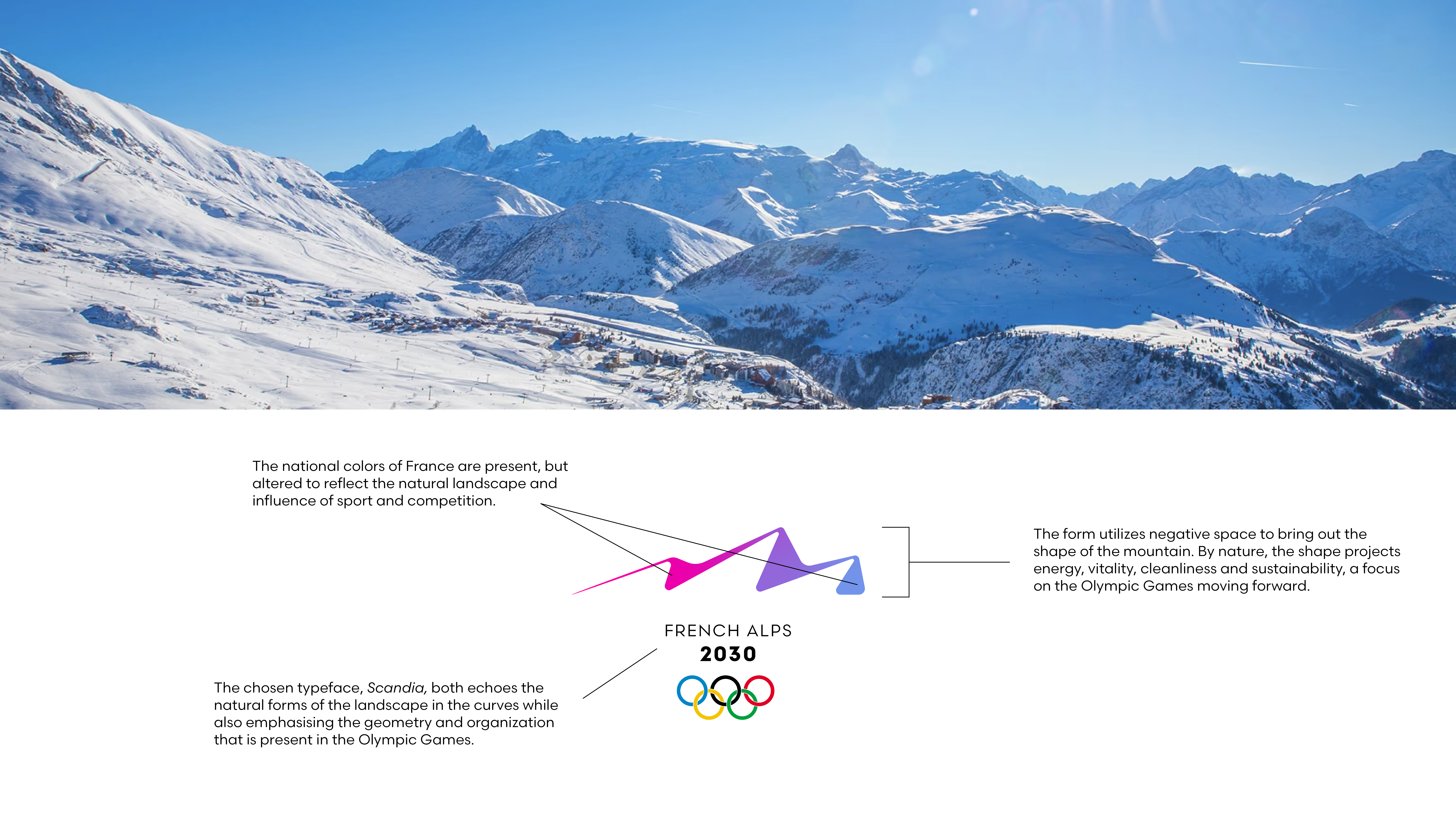
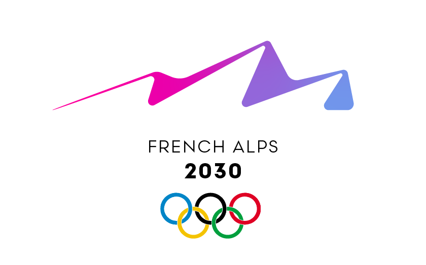
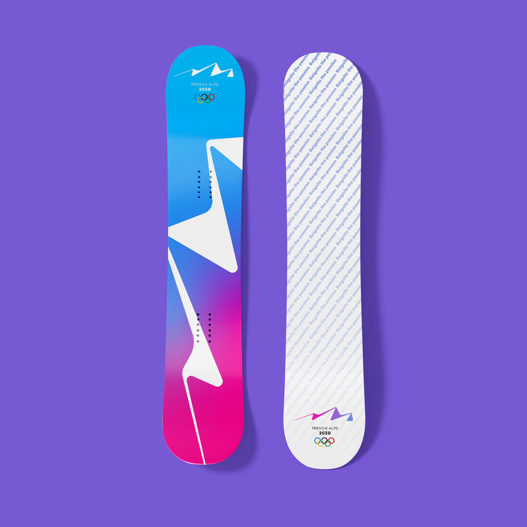
Taking inspiration from the colors of the French flag, the majesty of the Alps, and the newly established emphasis on sustainability and environmental stewardship, the 2030 Olympic logo combines straight line with curves, much like the landscape of the French Alps thelselves.
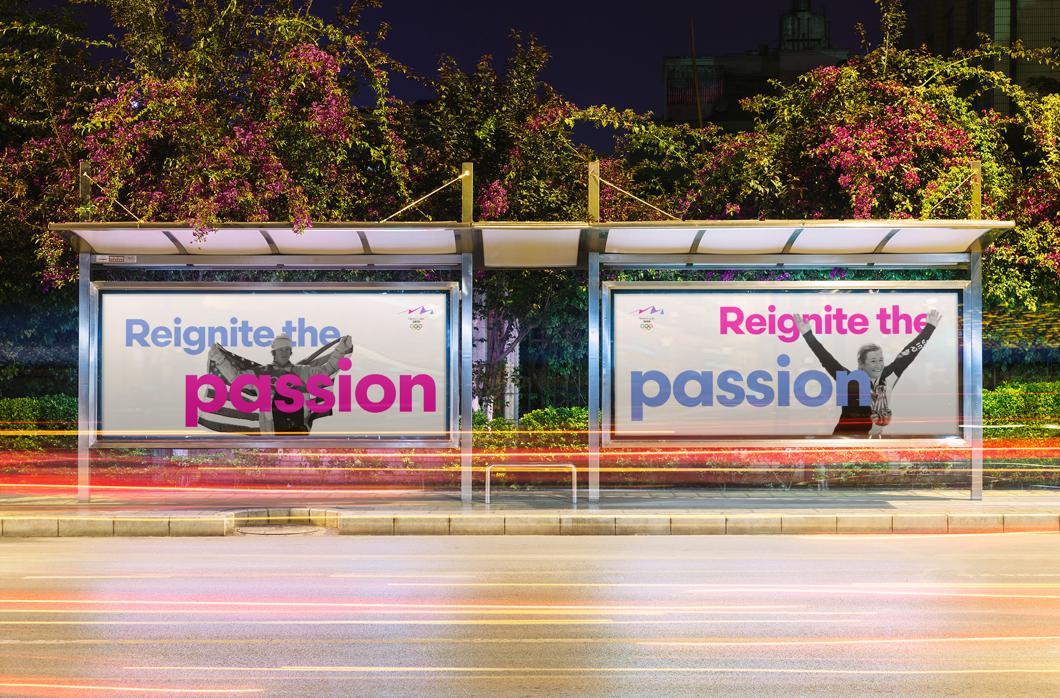
Physical Advertisement
Connecting the fans of the Olympic Games to the action is paramount for all physical OOH advertisements around the village.
Pictograms
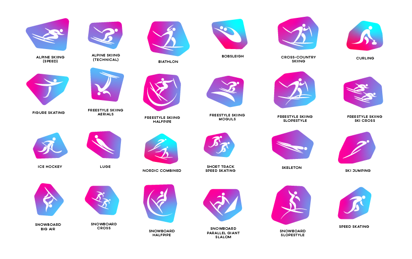
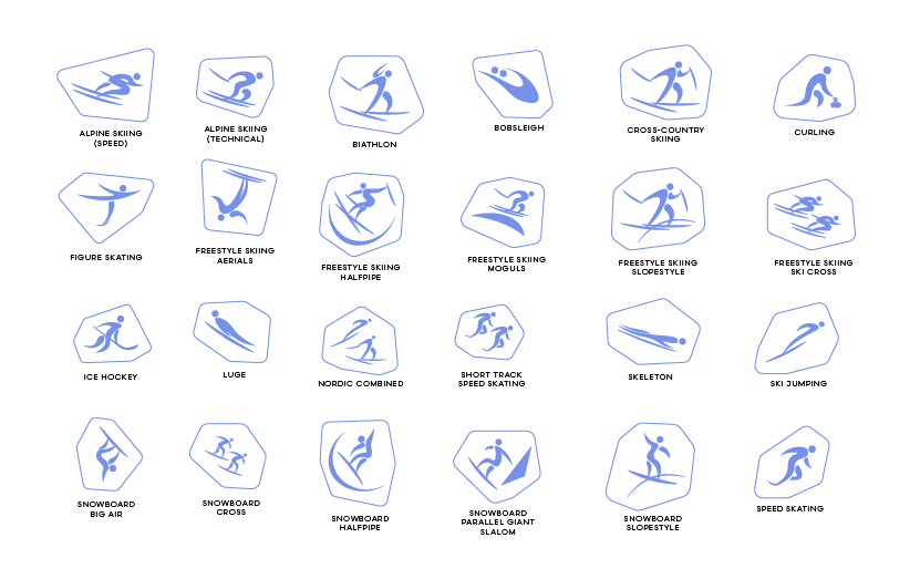
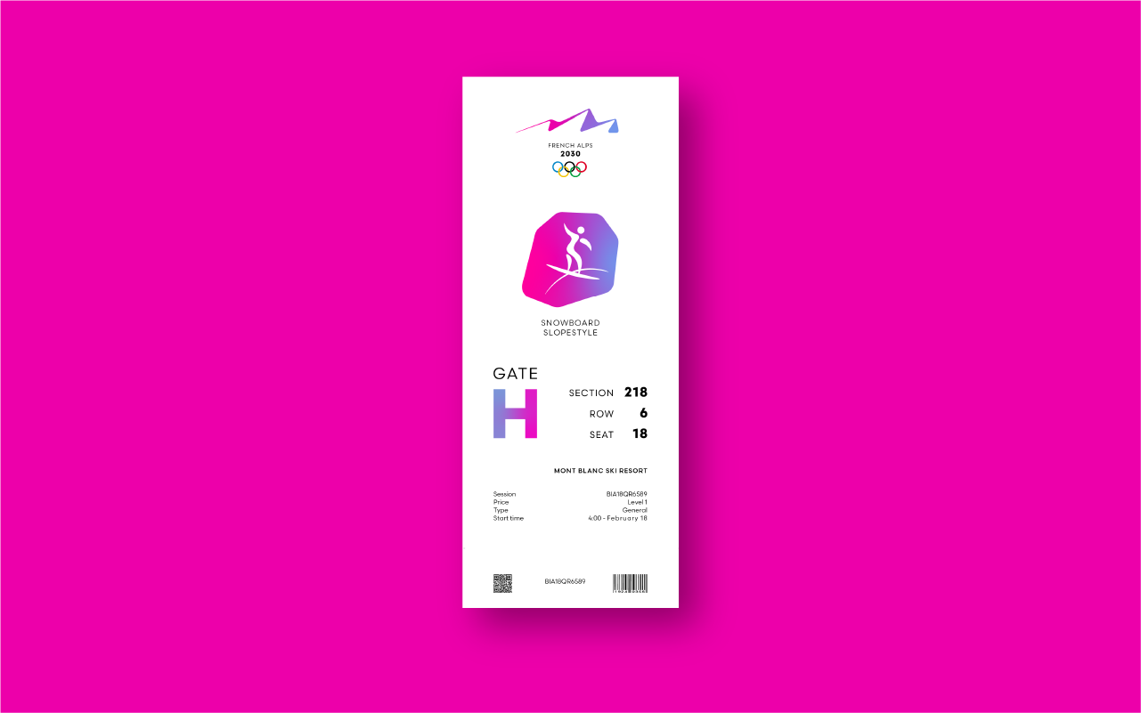
Acting as a quick reference guide that does not rely on language in order to effectively communicate to a global audience, olympic pictograms are effectively the basis for visual commuincation at the event level. Emphasising the curves that were accentuated in the main olympic logo, these pictograms highlight the human form in it's natural element, in motion.
Rationale
The shape of the Olympics logo eludes to the energy the Winter Games brings to the world every 4 years, one constant line, buzzing around a sihlouette, much like the fans of the Winter Games themselves. The color pallette borrows from the French flag, the notorious picturesque sunsets of the Alps, local villages, and a focus on sustainability by the IOC to create a mark that not only excites fans for the looming competition, but blends the colors in a way that evokes the feeling fans have as they blend together in a multicolored sea to take in the XXVI Olympic Winter Games.
Selected Works

ForeverLawn Brand RedesignCorporate Design
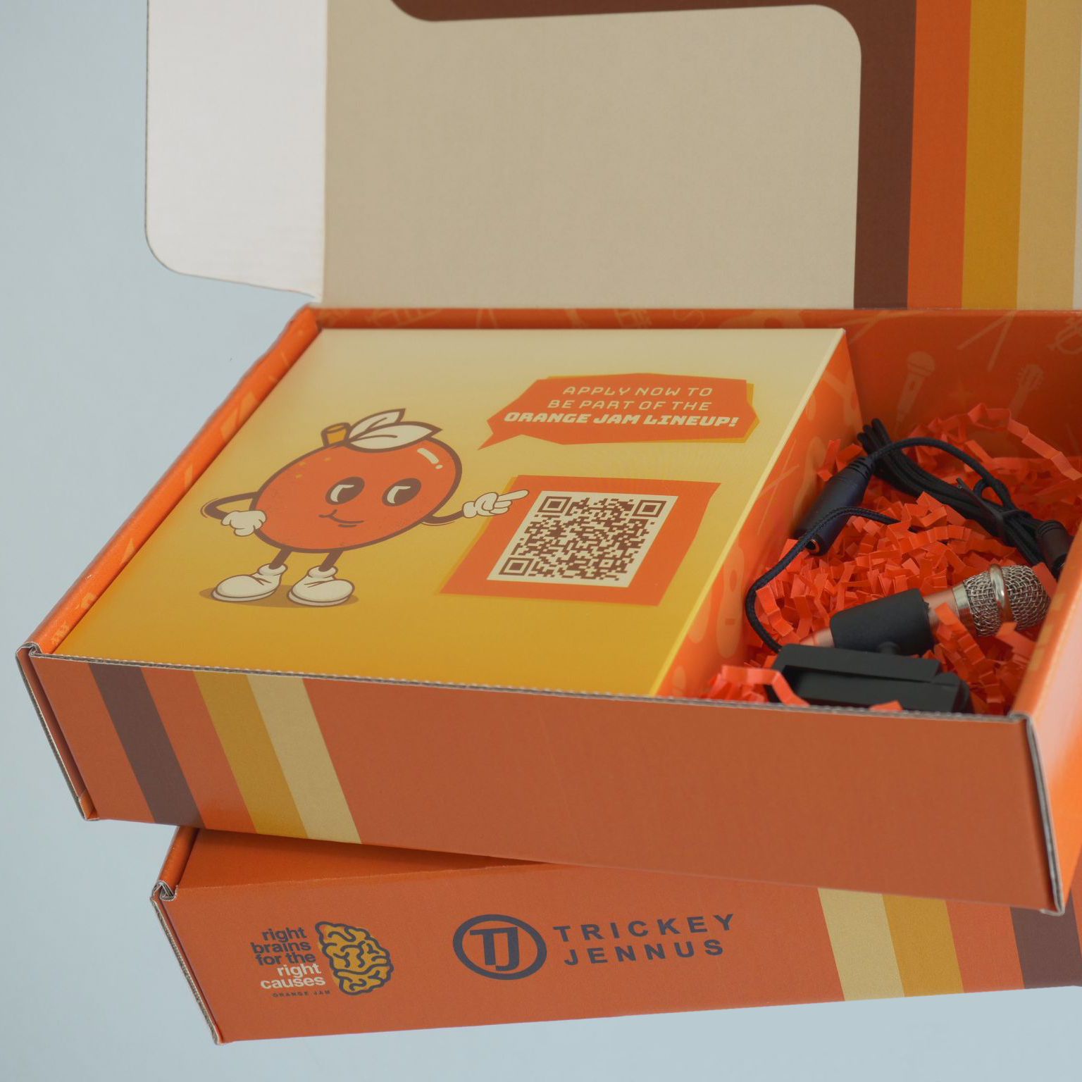
Self-promotion mailerPrint Design
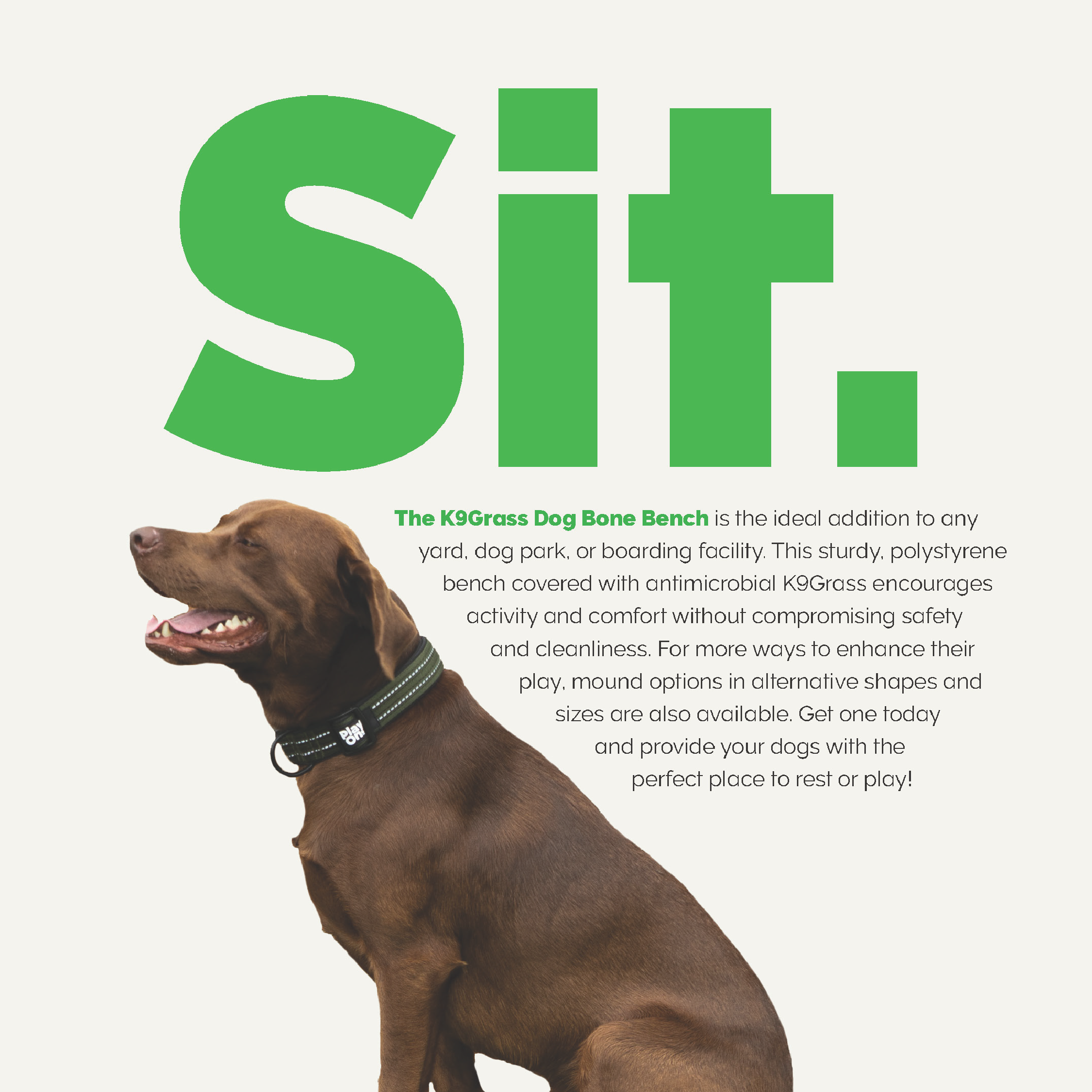
Print DesignPrint Design
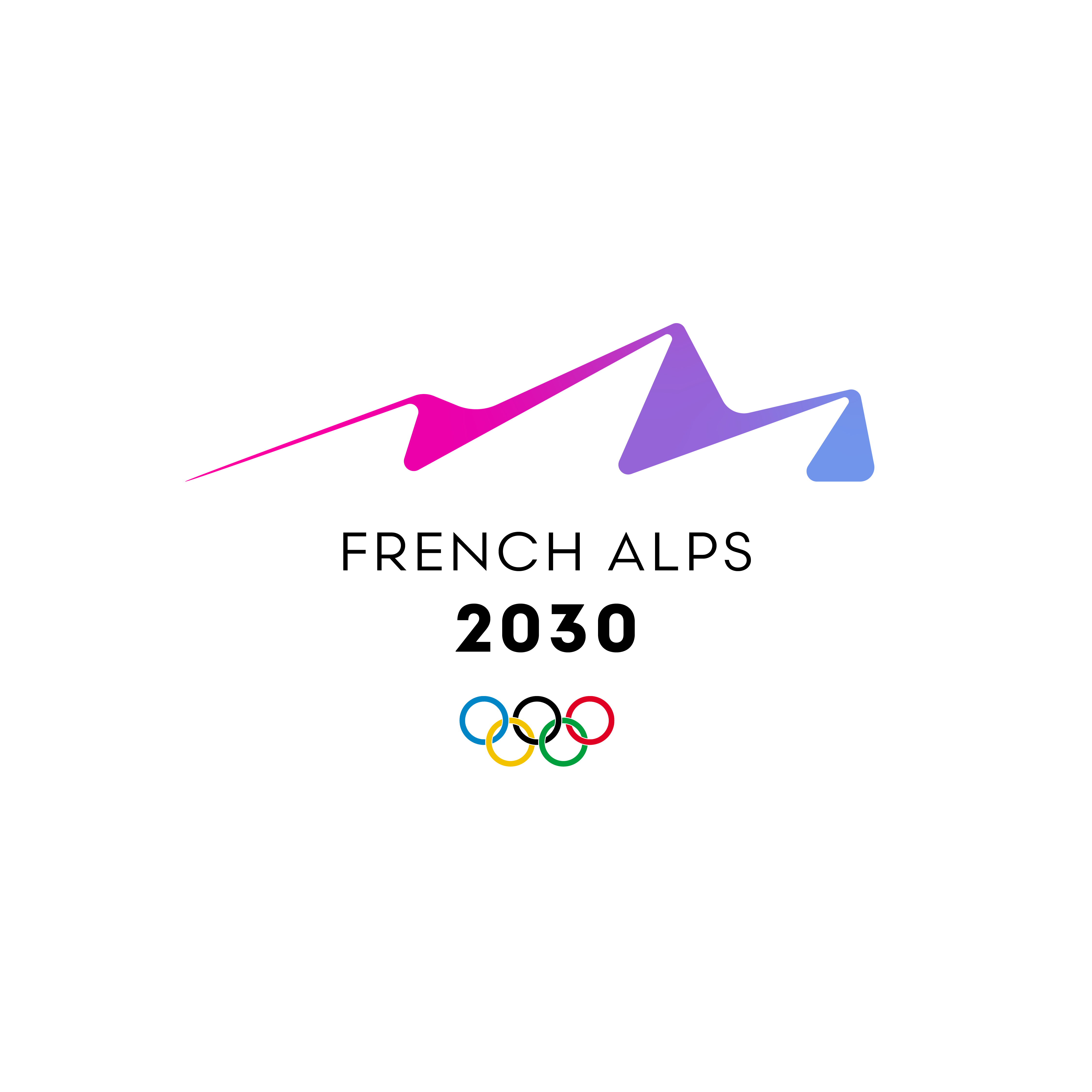
2030 Winter OlympicsIdentity

2032 Summer OlympicsIdentity
2034 Winter OlympicsIdentity

Social MediaSocial

Spirit Airlines RedesignCorporate Design

